Role: Brand Designer and UI UX Designer
Tool: Pen & Paper, Sketch, Figma, Illustrator
Duration: 05 2025
This project reflects my approach to brand design: combining conceptual thinking, systems-driven execution, and a deep understanding of emerging technology markets.
In 2025, I partnered with an AI startup at its earliest stage to define and design its brand identity from the ground up.
Working closely with the founding team, I transformed strategic insights and product vision into a visual system that communicates innovation, trust, and scalability.
Satellica is an AI-powered research platform that enables teams to conduct interviews, usability tests, and insight analysis faster and at scale.
The name “Satellica” draws inspiration from the concept of satellites — symbolizing connectivity, intelligence, and exploration. The team envisioned a brand identity that feels modern, technological, and academically grounded.
1 — Brainstorming the Concept
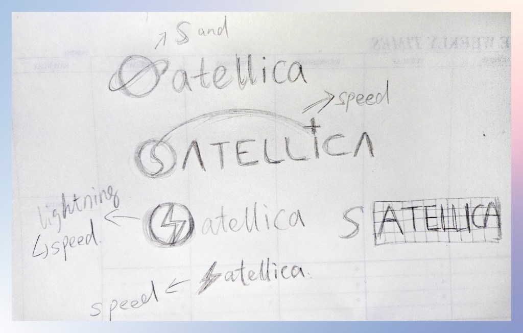
The name “Satellica” immediately evoked imagery of the universe — a dark, infinite space illuminated by distant stars and purple universe tones. Inspired by this atmosphere, I began sketching a range of visual concepts, exploring forms and symbols that reflect intelligence, connection, and futuristic technology.
After creating over 60 drafts, I narrowed my focus to five or six key symbols that reflect the brand’s philosophy. I combined an “S” with a circle to represent a satellite, tying back to the brand name. For the “S” shape, I incorporated a lightning symbol to convey the speed of the AI platform. I also replaced the dot on the letter “i” with a star to evoke a space-inspired atmosphere, and added an arc extending from the “S” to the star to reinforce the idea of fast, seamless connection.
2 — Align stakeholders and define the design direction.
After narrowing down the initial explorations to five concepts, I presented them to key stakeholders to gather feedback and identify the strongest strategic direction. Through collaborative discussions, we aligned on emphasizing the “S” as the brand’s distinctive visual anchor, while keeping the remaining letterforms clean, minimal, and technology-driven. This approach created a logo that feels both recognizable and modern, while maintaining flexibility for future brand applications.
3 — Refine the Concept into a Digital Mark
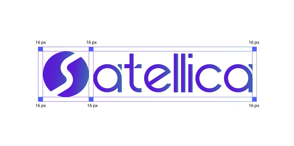
I translated the selected concept from sketch to digital, using the “S” as the primary visual anchor. Through refinement of geometry, proportion, and spacing, I developed a cleaner and more distinctive wordmark while maintaining a modern, technology-driven aesthetic. The final construction was designed to remain cohesive and scalable across brand touchpoints.