The reason behind the creation of this logo dates back to the day I was learning to drive. My instructor is a Pakistani, and upon learning that I was a designer, he mentioned that his driving school needed a logo. That marked my first client in 2023. I inquired about the name of the school and its core values. When I returned home after the lesson, I immediately started brainstorming.
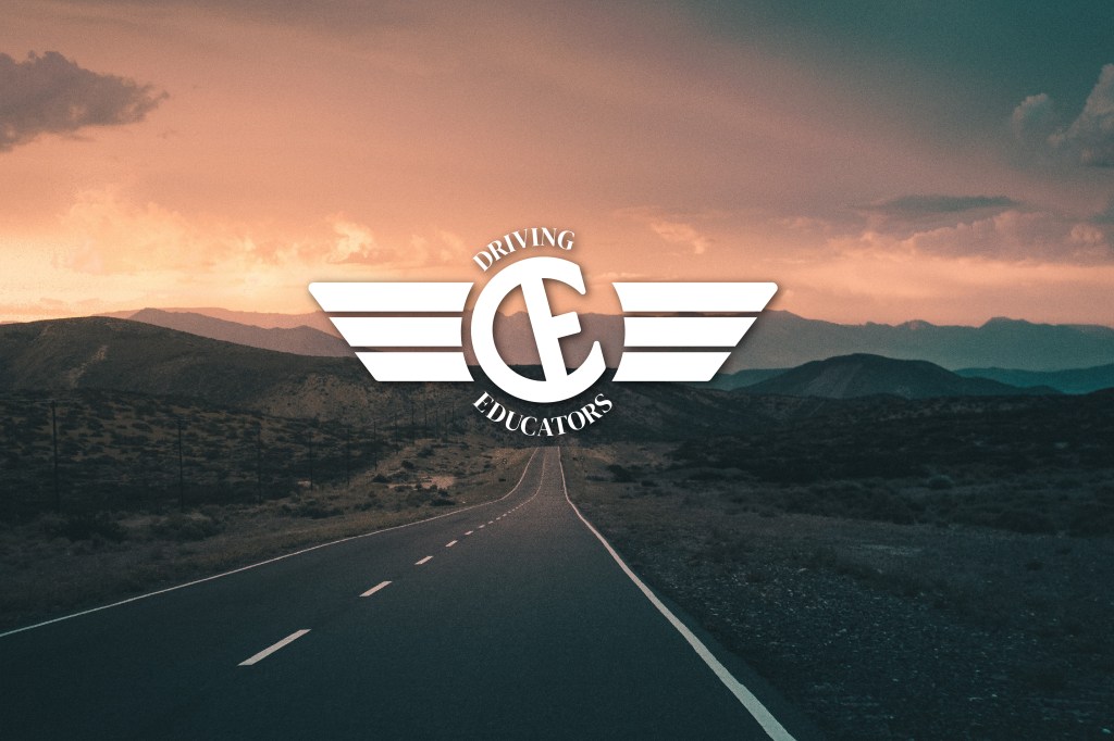
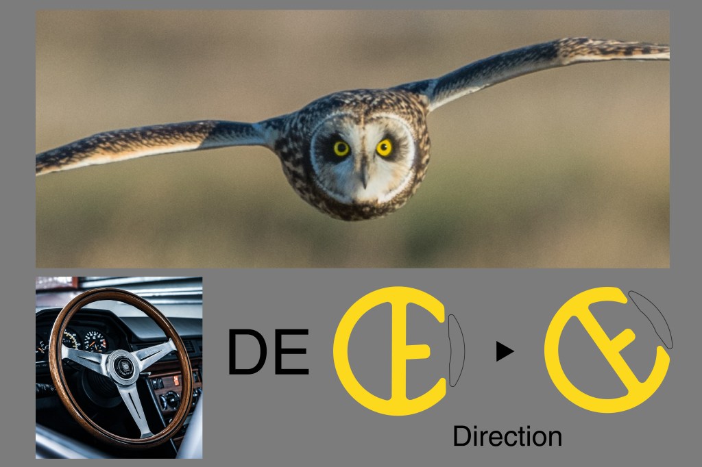
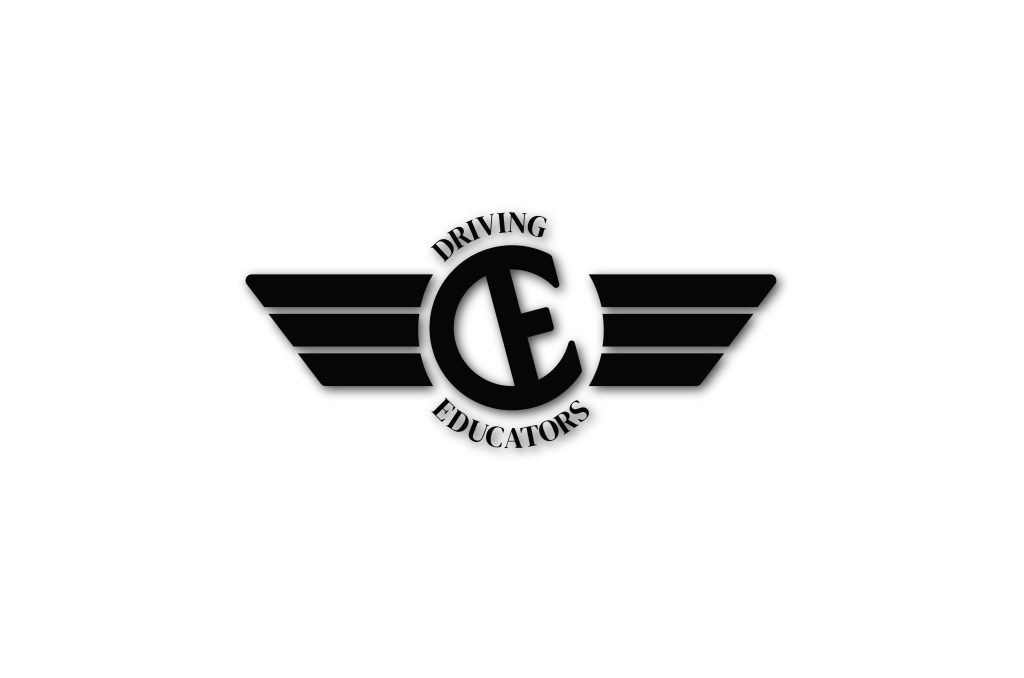
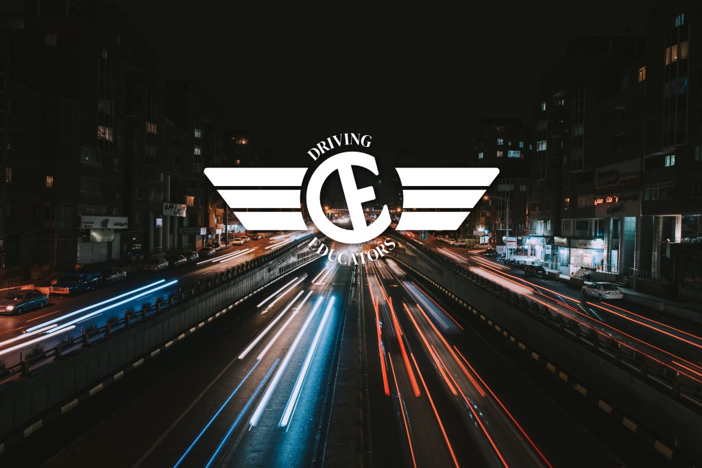
The school is called Driving Educators, abbreviated as DE. I decided to analyze the two words separately and draw inspiration from their individual meanings. ‘Driving’ evokes a sense of freedom and fluidity, which led me to think about a bird. Meanwhile, ‘educators’ conveys a feeling of guidance and direction. Combining these ideas, I incorporated a steering element and transformed the bird into an eagle.

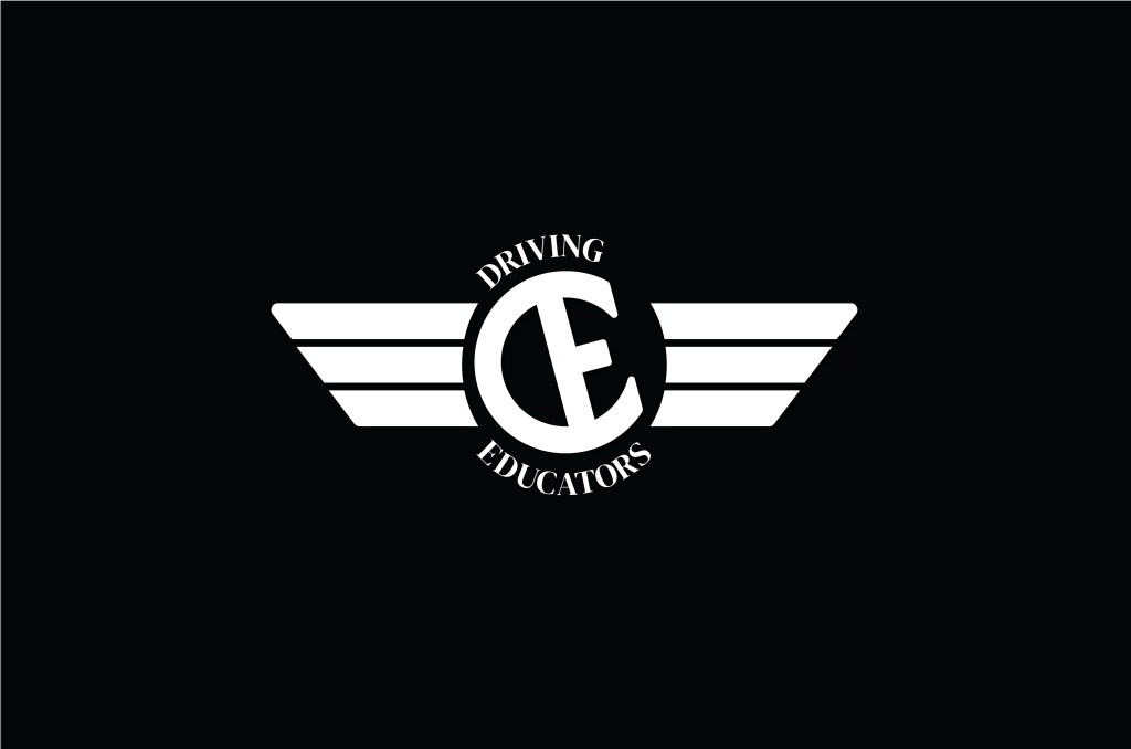
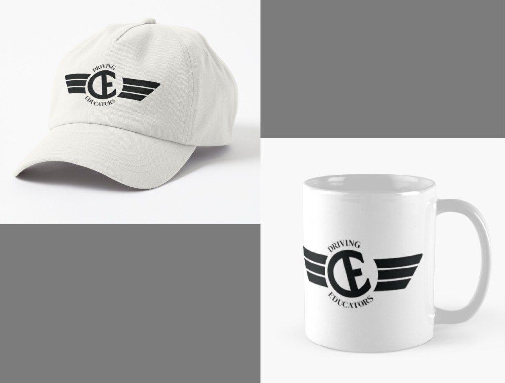
Concerning the school’s name, DE, both my client and I desired to merge the two elements into a cohesive design. After meticulously sketching around 100 drafts by hand, I managed to shape the two letters into a steering wheel. To enhance the sense of dynamism, I intentionally tilted the steering element.
I introduced wings alongside the steering wheel to create a sense of freedom and flight. This addition enhanced the overall design, imparting a feeling of liberation. After completing this step, the next task involved carefully selecting the colours and adjusting the typographies to achieve the desired outcome.
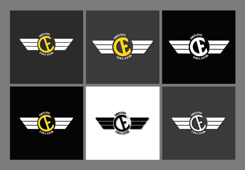
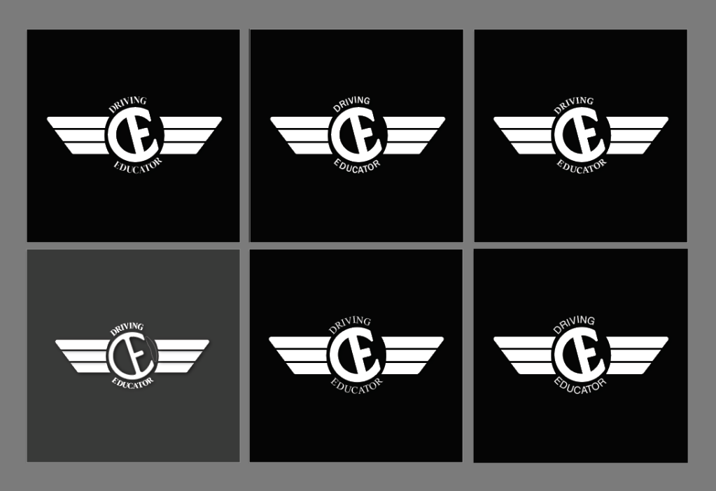
After trying multiple typographies, I decided to use the DM Serif Display font to show the classy and rigorous teaching attitude of the driving school.


Thanks for reading!
